Tuesday, 9 July 2013

Final images

Here are the final edited images:

F 10
1/100
ISO 400

F 10
1/100
ISO 400

F 10
1/100
ISO 400

F 10
1/100
ISO 400

F 10
1/100
ISO 400

F 10
1/100
ISO 400

F 12
1/80
ISO 400

F 10
1/100
ISO 400

When I was capturing these images I encountered some problems such as bad lighting, trouble getting around the building due to the sheer amount of debris. I over came these problems by adjusting the angle and settings of my camera to solve the lighting problem and choosing to avoid entering rooms that were dangerous to get to. I think that overall my images have turned out quite well and I am very pleased with the final edits. If I were to do this shoot again I think I would take double the amount of photos so that I had more to choose from when it comes to choosing the final images, and I would make sure that my battery was charged fully as mine was running low, causing me to take less photos.


Tuesday, 2 July 2013

Rob

In this essay i am going to discuss and analyse the image that I have created using the formal elements and Panofsky's Trichotomy. 
For this assignment we were each given a scenario from a classmate and we had to re enact that scenario in a photograph using the appropriate flowers to convey emotions. My scenario was a man walking in on his partner having an affair with another man. To do this I took a photograph of two of my fellow classmates in an intimate embrace using the studio. I then took a photograph of another classmate looking shocked, also in the studio. I obtained a photograph of a bedroom off of the Internet and put all three images together on Photoshop. When I had placed my models in the photograph of the bedroom, I gathered various images of  flower called Redbud which symbolises betrayal, and placed them in photo frames around the room. I got some criticism for this image such as the models were too big,they looked like they were floating and the images on the walls didn't look real. Following this, I added shadows to my models so that it didn't look like they were floating anymore. There was nothing I could do about their sizes as I had already flattened the image. I adjusted the colour and shadows on the images on the walls to make them look more realistic and I think I did a fairly good job.
I have used line in my image to constantly lead the viewers eye back to the main focus of my image, which is the couple in an intimate embrace. When you see that Jed is looking at the couple in the corner, your eyes will follow the implied line created by his eyes. Once you are looking at the couple, the images on the wall leads you up toward the ceiling. The ceiling leads you to the images on the next wall, which leads you back to Jed, and over and over again like a full circle. I also used tone to direct the viewers eye to the couple. In the image by making the right side of the image darker than the left. As the right side is darker and there is more going on on that side of the image, most of the viewers attention will be on the right hand side of the image. The way that Jed is standing is relevant to the theme of the image as it is the gesture that represents shock, which I thought was the most appropriate gesture for the scenario at hand, especially as the flowers on the walls represent betrayal. 
I think that this image is a Window as it is detailing an event that happened at a specific place, although there was no specific time allocated in the story, and the image doesn't reflect me in any way, therefore it cannot be a Mirror.
In conclusion, I believe that I have used formal elements such as line and tone effectively to direct the viewers eye to the main focus, around the image, and back to the main focus in a continuous circle .  I think that I have successfully used Photoshop in creating an image that looks realistic and I also believe that I have used gesture and flowers correctly to triumphantly portray shock and betrayal, the message I intended to convey to the viewer.

Thursday, 20 June 2013

Location Project - Initial ideas - Research

The theme i have chosen to do for my location shoot is Urban Decay: A retrospective look on the uses of buildings then And now. I have chosen this because the topic interests me greatly and i believe that these images would be aesthetically pleasing to the public.

Key Practitioners

Mathew Merrett is a fine art photographer whose passion lies with urban decay photography. Here are a few of his images:


These images are similar to the work that i intend to produce. As you can see, there is much to look at in the images and they are almost guaranteed to catch the viewer's eye. The looking space within the second image is rather chilling and gives a sense of claustrophobia, whereas in the first image there is a sense of being trapped.

Tuesday, 11 June 2013

Overview

Sport Photography


Untitled
Unknown 
2012
Camera: 7D
70-300mm zoom
Tv mode
1/60-1/125
ISO 100


Wildlife photography


Untitled
Odette Barber
2012
Telephoto lens
F8
ISO 100


Lifestyle Photography


Untitled
Jeannie Guzis
2010
F8
1/125
ISO 400

Tuesday, 4 June 2013

Equipment

In this post i shall highlight the equipment used in location photography.

When photographing buildings it is advised to use a tilt shift lens. This lens distorts the original perspective, making the building appear face on. However, this effect can be achieved using the skew tool on photoshop.

When photographing wildlife it helps to have a telephoto lens, for example, 75-300 mm.  This lens is useful for wildlife photography due to the fact that it allows the photographer to zoom in extremely close so as not to disturb the wildlife.

A 50 mm lens would be useful when photographing dark scenarios such as bands or inside clubs as it has a very low F stop which allows a lot of light into the camera.


The cons of using a tilt shift lens are that the full shift decreases the sharpness of the image and creates some problems with the auto exposure.
The lenses themselves are not designed for any parallel movements.

The cons of using a telephoto lens are that the F stop cannot be manipulated efficiently. This means that darker images are harder to take, requiring a tripod.

The cons of a 50mm lens are that you cannot zoom in.


Tuesday, 14 May 2013

Buildings

As part of our location unit we were required to take pictures for the 'architecture' category. Here are my images;


This image didn't need editing on photoshop because the building looks face on despite the fact that it has not been altered. The downside to this image is that there are visual distractions at the front of the church in the form of signs.


In this image, the perspective has distorted the building. I tried to fix this on photoshop but i couldn't quite figure out how to do it properly.


The image above is an architectural image of a clock tower. I have not attempted to manipulate this image whatsoever. I have incorporated the rule of thirds into this image as the clock tower takes up one third, and the clouds take up two. This directs the viewers eye to the main focus, the clock tower.


Thursday, 9 May 2013

Location

As part of the 'on location' unit, we were required to capture images of shadows and reflections. here are my images;
There are certain compositional elements in this image such as leading lines and repetition. I have darkened the shadows on this image.

I have converted this image into greyscale and bumped up the contrast to make the shadow of the tree considerably darker than it was in the original image.


Key Practitioners

Pete Seaward. 


Seaward compiles his work in different types of location photography. The few examples i have given are landscape. They are all quite aesthetically pleasing, i would like to be able to take inspiration from, and produce images that are similar to these. 


Tuesday, 7 May 2013

Event Photography

As part of the location photography unit, we were required to attend the Fair Trade event in our college reception area.
here are a few examples of the images i have taken:


Some of the problems i encountered during this task were as follows; uncooperative subjects; uneven lighting; area too crowded.
Solutions to said problems were as follows; photograph uncooperative subjects without then knowing or choose another subject; adjust exposure levels on camera; move out of the crowd and photograph from the sidelines.


Wednesday, 24 April 2013

Task 3

For task three we were asked to do a series of images using either people or props to portray one word. The word i chose was love. Here is the series:


This series of images i think came out quite well and i am pleased with the result. The message is that whether it is two men, two women, or a man and a woman, it is all love no matter what it looks like, no love is wrong.

Task 2

For task two we had to take two product images using either high, mid, or low key lighting. Here are my product images:
I took this image to represent the fact that i enjoy reading, making reading a large part of my life.                                                   

I took this image because personally, i don't like my body and this was my way of fixing it. I have been very self conscious for a long time so this also affected my personality a lot.

Thursday, 21 March 2013

Task 1

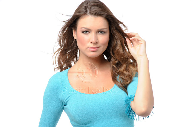
In this task we were asked to take three head shots of the same model, using high key; mid key and low key lighting. i used a fellow classmate as my model and decided on a fashion theme for my shoot. The image for each lighting key depicts the emotion commonly associated with said key.

High key:

Mid key: 

Low key:

I am really quite pleased with how these images turned out and i especially like the low key image. The high key image's background isn't pure white but that can be fixed on photoshop.

Tuesday, 12 March 2013

Photoshop


A large part of our course involves lots of editing images using Photoshop. We were given three tutorials on how to do various edits. Here are my attempts;
This is the original image,
and this is my edited version. The first tutorial we were given was on skin softening. Although it is hard to see unless you are zoomed in, in the original image, her skin is darker and her freckles are more visible. Using the skin softening method i made her skin look smoother and paler.


This is the original image,


and this is my edited version. As you can clearly see, in the original image the woman's left eye is slightly closed making the image look odd. Using Photoshop i have put the right eye over the left eye and flipped it around to make the eyes look the same and therefor vastly improving the image.

This is the original image,


and this is my edited version. In this image i have changed her eye colour from brown to a very bright blue. 
Here are the links to the tutorials...